User Interface#
Dialogs#
- class anchorpoint.Dialog#
Creates an Anchorpoint styled Dialog that can be used to display arbitrary user interfaces within Anchorpoint. A dialog consists of rows of interface elements, a title and an icon. This makes it possible to build very simple dialogs where each element starts in a new row.
Create a Dialog with a title and three rows (a text label, an input field, and a button):

>>> dialog = anchorpoint.Dialog()
>>> dialog.title = "My Custom Dialog"
>>> dialog.add_text("First Row")
>>> dialog.add_input("Second Row")
>>> dialog.add_button("Third Row")
>>> dialog.show()
The dialog also allows any number of elements to be lined up in a row. You can also use the ‘tab escape character’ to add a horizontal tab to the layout.
Create a Dialog with a title and two rows were the first row consists out of two elements:
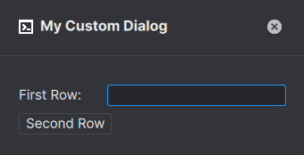
>>> dialog = anchorpoint.Dialog()
>>> dialog.title = "My Custom Dialog"
>>> dialog.add_text("First Row: ").add_input()
>>> dialog.add_button("Second Row")
>>> dialog.show()
Most Dialog elements allow the registration of callbacks that are called when the value was changed by the user. A callback can be a simple python function that takes two parameters, the
Dialogand the value of the Dialog element.Register a callback that is triggered when the input element is changed by user input:
>>> def my_callback(dialog: anchorpoint.Dialog, value):
>>>     print ("Input has changed:" + value)
>>>
>>> dialog = anchorpoint.Dialog()
>>> dialog.add_input(callback = my_callback)
>>> dialog.show()
A button callback takes only one parameter, the
Dialog(because the value would always be True):>>> def my_callback(dialog: anchorpoint.Dialog): >>> print ("Button Pressed") >>> >>> dialog = anchorpoint.Dialog() >>> dialog.add_button("OK", callback = my_callback) >>> dialog.show()
Of course, you can also register a lambda as a callback:
>>> dialog = anchorpoint.Dialog()
>>> dialog.add_button("OK", callback = lambda dialog: print("Button Pressed"))
>>> dialog.show()
A very common scenario is a Dialog that shows several inputs to the user. The script is evaluating the inputs when the user is clicking an “OK” button. You can assign variable names to most Dialog elements so that you can easily retrieve their values at any point in time:
Show multiple input fields to the user and evaluate them when the user clicks the “OK” button:
>>> def button_callback(dialog: anchorpoint.Dialog):
>>>     input = dialog.get_value("input_field") # Retrieve the dialog value again by using the variable name "input_field"
>>>     task = dialog.get_value("task") # Retrieve the dialog value again by using the variable name "task"
>>>
>>> dialog = anchorpoint.Dialog()
>>> dialog.add_input(var="input_field") # Assign a variable named "input_field"
>>> dialog.add_dropdown("Animating", ["Rigging", "Animating"], var="task") # Assign a variable named "task"
>>> dialog.add_button("OK", callback = button_callback)
>>> dialog.show()
You can register a callback using the callback_closed property that gets triggered whenever the Dialog closes. This is usually a good place to store
Settings, if required:Show a Dialog with an input field. Store the input value when the Dialog is closed.
>>> def dialog_closed(dialog: anchorpoint.Dialog):
>>>     settings = apsync.Settings()
>>>     settings.set("input", dialog.get_value("input"))
>>>     settings.store()
>>>
>>> dialog = anchorpoint.Dialog()
>>> dialog.add_input(var="input")
>>> dialog.callback_closed = dialog_closed
>>> dialog.show()
Alternatively, you can assign the
Settingsobject directly to the Dialog. By that, the Dialog reads and writes directly to theSettings.>>> dialog = anchorpoint.Dialog() >>> dialog.add_input(var="input") >>> dialog.callback_closed = dialog_closed >>> settings = apsync.Settings() >>> dialog.show(settings)
- add_text(text: str, var: Optional[str] = None) anchorpoint.DialogEntry#
Adds a text element to the interface. Basic HTML syntax is supported
- Parameters
text (str) – The text
var (Optional[str]) – Assign a variable name to the text that can be used to hide the text, for example
Example
>>> dialog = anchorpoint.Dialog()
>>> dialog.add_text("<b>Hello World</b>")
>>> dialog.show()
- add_input(default: str = '', placeholder: str = '', callback: Optional[Callable[[anchorpoint.Dialog, object], None]] = None, var: Optional[str] = None, enabled: bool = True, browse: Optional[anchorpoint.BrowseType] = None, browse_path: Optional[str] = None, password: bool = False, width: int = 200, validate_callback: Optional[Callable[[anchorpoint.Dialog, object], Optional[str]]] = None) anchorpoint.DialogEntry#
Adds an input field to the interface.
- Parameters
default (str) – The default text that is shown when the dialog shows up
placeholder (str) – A placeholder text that is shown in an empty input field
callback (Callable[[anchorpoint.Dialog, object], None]) – A callback that is triggered when the input field content changes
var (Optional[str]) – Assign a variable name to the input field that can be used to retrieve the value from the
Dialogagainenabled (bool) – Set to False to disable the interface element
browse (Optional[anchorpoint.BrowseType]) – If set, shows a ‘browse’ button right beside the input field. Set to anchorpoint.BrowseType.File to ask for a file input or anchorpoint.BrowseType.Folder for a folder input
browse_path (Optional[str]) – If not set, the browse utility opens in the users home location
password (bool) – Set to True to enable password mode
width (int) – The width of the input field. Default is 200
validate_callback (Callable[[anchorpoint.Dialog, object], Optional[str]]) – A callback that is triggered when the input field content changed and needs validation. Return a reason if the input field is not valid.
Examples
- Provide a callback to get notified on changes
>>> def my_callback(dialog: anchorpoint.Dialog, value):
>>>     print (value)
>>>
>>> dialog = anchorpoint.Dialog()
>>> dialog.add_input("My Default Value", callback=my_callback)
>>> dialog.show()
- set_browse_path(var: str, path: str) None#
Sets the default browse path for the input field.
- Parameters
var (str) – The variable name of the input field
path (str) – The path to set as default
Example
>>> dialog.set_browse_path(var="my_input", path=my_path)
- add_info(text: str, var: Optional[str] = None) anchorpoint.DialogEntry#
Adds an info element to the interface. Basic HTML syntax is supported
- Parameters
text (str) – The info
var (Optional[str]) – Assign a variable name to the info text that can be used to hide the info text, for example
Example
>>> dialog = anchorpoint.Dialog()
>>> dialog.add_info("Lorem <b>ipsum</b> dolor sit amet")
>>> dialog.show()
- add_checkbox(default: bool = False, callback: Optional[Callable[[anchorpoint.Dialog, object], None]] = None, var: Optional[str] = None, enabled: bool = True, text: str = '') anchorpoint.DialogEntry#
Adds a checkbox element to the interface.
- Parameters
default (bool) – True, if the checkbox should be checked, False otherwise
callback (Callable[[anchorpoint.Dialog, object], None]) – A callback that is triggered when the check state changes
var (Optional[str]) – Assign a variable name to the checkbox that can be used to retrieve the value from the
Dialogagainenabled (bool) – Set to False to disable the interface element
text (str) – The text to display next to the checkbox
Examples
- Provide a callback to get notified on changes
>>> def my_callback(dialog: anchorpoint.Dialog, value):
>>>     print (value)
>>>
>>> dialog = anchorpoint.Dialog()
>>> dialog.add_checkbox(True, callback=my_callback)
>>> dialog.show()
- add_switch(default: bool = False, callback: Optional[Callable[[anchorpoint.Dialog, object], None]] = None, var: Optional[str] = None, enabled: bool = True, text: str = '') anchorpoint.DialogEntry#
Adds a switch element to the interface.
- Parameters
default (bool) – True, if the switch should be enabled, False otherwise
callback (Callable[[anchorpoint.Dialog, object], None]) – A callback that is triggered when the switch state changes
var (Optional[str]) – Assign a variable name to the switch that can be used to retrieve the value from the
Dialogagainenabled (bool) – Set to False to disable the interface element
text (str) – The text to display next to the switch
Examples
- Provide a callback to get notified on changes
>>> def my_callback(dialog: anchorpoint.Dialog, value):
>>>     print (value)
>>>
>>> dialog = anchorpoint.Dialog()
>>> dialog.add_switch(True, text="Enable Feature", callback=my_callback)
>>> dialog.show()
- add_dropdown(default: str, values: List[Union[anchorpoint.DropdownEntry, str]], callback: Optional[Callable[[anchorpoint.Dialog, object], None]] = None, var: Optional[str] = None, enabled: bool = True, filterable: bool = False, validate_callback: Optional[Callable[[anchorpoint.Dialog, object], Optional[str]]] = None) anchorpoint.DialogEntry#
Adds a dropdown element to the interface.
- Parameters
default (str) – The preselected entry in the dropdown
values (list | list[
DropdownEntry]) – The list of entries in the dropdowncallback (Callable[[anchorpoint.Dialog, object], None]) – A callback that is triggered when the selected entry has changed
var (Optional[str]) – Assign a variable name to the dropdown that can be used to retrieve the value from the
Dialogagainenabled (bool) – Set to False to disable the interface element
Examples
- Provide a callback to get notified on changes
>>> def my_callback(dialog: anchorpoint.Dialog, value):
>>>     print (value)
>>>
>>> values = ["Modeling", "Rigging", "Animation", "Rendering"]
>>> dialog = anchorpoint.Dialog()
>>> dialog.add_dropdown("Modeling", values, callback=my_callback)
>>> dialog.show()
- add_button(text: str, callback: Optional[Callable[[anchorpoint.Dialog], None]] = None, var: Optional[str] = None, enabled: bool = True, primary: bool = True) anchorpoint.DialogEntry#
Adds a button element to the interface that the user can press.
- Parameters
text (str) – The text that is displayed on the button
callback (Callable[[anchorpoint.Dialog], None]) – A callback that is triggered when the user pressed the button
var (Optional[str]) – Assign a variable name to the dropdown that can be used to retrieve the value from the
Dialogagainenabled (bool) – Set to False to disable the interface element
Examples
- Provide a callback to get notified on changes
>>> def my_callback(dialog: anchorpoint.Dialog, value):
>>>     print (value)
>>>
>>> entries = ["Modeling", "Rigging", "Animation", "Rendering"]
>>> dialog = anchorpoint.Dialog()
>>> dialog.add_dropdown("Animation", entries, callback=my_callback)
>>> dialog.show()
- add_separator() anchorpoint.DialogEntry#
Adds a visual separator to the dialog.
- add_empty() anchorpoint.DialogEntry#
Adds empty space to the Dialog. This can either be used to indent an entry or to create a new line.
Example
>>> dialog = anchorpoint.Dialog()
>>> dialog.add_empty().add_text("Indent")
>>> dialog.add_empty()
>>> dialog.add_text("I am in a new line")
>>> dialog.show()
- start_section(text: str, foldable: bool = True, folded: bool = True, enabled: bool = True) anchorpoint.DialogEntry#
Starts a new section. Set foldable=True to make the section foldable and set folded=False to unfold the section by default. Use
end_section()to close the last opened section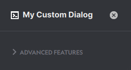
- Parameters
text (str) – The section header
foldable (bool) – Toggles whether or not the section is foldable by the user
folded (bool) – Toggles whether or not the section is folded by default
enabled (bool) – Set to False to disable the interface element
Examples
- Add a folded section with a button element inside it
>>> dialog = anchorpoint.Dialog()
>>> dialog.title = "My Custom Dialog"
>>> dialog.start_section("Advanced Features", folded = True)
>>> dialog.add_button("An Advanced Button")
>>> dialog.end_section()
>>> dialog.show()
- end_section() anchorpoint.DialogEntry#
Ends the past opened section, see
start_section()
- show(settings: apsync.Settings, store_settings_on_close: bool)#
Helper for @overload to raise when called.
Shows the Dialog to the user. You can optionally provide a
Settingsobject to persist the user input.- Examples:
>>> dialog = anchorpoint.Dialog()
>>> dialog.add_text("Hello Anchorpoint Users")
>>> settings = apsync.Settings()
>>> dialog.show()
- show(settings: apsync.SharedSettings, store_settings_on_close: bool)
Helper for @overload to raise when called.
Shows the Dialog to the user. You can optionally provide a
SharedSettingsobject to persist the user input.- Examples:
>>> dialog = anchorpoint.Dialog()
>>> dialog.add_text("Hello Anchorpoint Users")
>>> settings = apsync.Settings(project.workspace_id, "Blender Action Settings")
>>> dialog.show()
- close() None#
Closes the Dialog.
Examples
>>> def button_callback(dialog: anchorpoint.Dialog):
>>>     dialog.close()
>>>
>>> dialog = anchorpoint.Dialog()
>>> dialog.add_button("Close Me", callback=button_callback)
>>> dialog.show()
- get_value(var: str) object#
Gets the current value of the dialog entry as identified by the assigned variable name ‘var’.
Examples
- Checks the value of a dropdown when the users clicks the OK button
>>> def button_pressed(dialog: anchorpoint.Dialog):
>>>     print("The selected task is: " + dialog.get_value("task"))
>>>
>>> dialog = anchorpoint.Dialog()
>>> dialog.add_dropdown(default="Modeling", values=["Modeling", "Animation"], var="task")
>>> dialog.add_button("OK", callback=button_pressed)
>>> dialog.show()
- set_value(var: str, value: object) None#
Sets the value of the dialog entry as identified by the assigned variable name ‘var’.
Examples
- Sets the text value of a button when a dropdown value is changed
>>> def dropdown_changed(dialog: anchorpoint.Dialog, value):
>>>     if value == "Blender": dialog.set_value("button", "Create Blender File")
>>>     elif value == "Photoshop": dialog.set_value("button", "Create Photoshop File")
>>>
>>> dialog = anchorpoint.Dialog()
>>> dialog.add_dropdown(default="Blender", values=["Blender", "Photoshop"], callback=dropdown_changed)
>>> dialog.add_button("Create Blender File", var="button")
>>> dialog.show()
- set_enabled(var: str, enabled: bool) None#
Toggles whether or not the dialog entry is enabled. A user cannot interact with a disabled dialog entry.
Examples
- Enable the OK button if an input field is not empty.
>>> def input_callback(dialog: anchorpoint.Dialog, value):
>>>     dialog.set_enabled("ok", len(value) > 0)
>>>
>>> dialog = anchorpoint.Dialog()
>>> dialog.add_input(callback=input_callback)
>>> dialog.add_button("OK", var="ok")
>>> dialog.show()
- hide_row(var: Optional[str] = None, hide: bool = True) None#
(Un)hides the entire row of dialog entries.
Examples
- Hide the OK button as long as the input field is empty
>>> def input_callback(dialog: anchorpoint.Dialog, value):
>>>     dialog.hide_row("ok", len(value) == 0)
>>>
>>> dialog = anchorpoint.Dialog()
>>> dialog.add_input(callback=input_callback)
>>> dialog.add_button("OK", var="ok")
>>> dialog.show()
- store_settings() None#
Stores the
SettingsorSharedSettingsthat are used by the Dialog. This is required when store_settings_on_close is False.Examples
>>> def button_callback(dialog: anchorpoint.Dialog):
>>>     dialog.store_settings()
>>>     dialog.close()
>>>
>>> settings = apsync.Settings()
>>> dialog = anchorpoint.Dialog()
>>> dialog.add_button("Close Me", callback=button_callback)
>>> dialog.show(settings, store_settings_on_close=False)
- property title: Optional[str]#
Sets the title of the dialog.
- Type
typing.Optional[str]
- property icon: Optional[str]#
Sets the icon of the Dialog.
- Type
typing.Optional[str]
- property icon_color: Optional[str]#
Sets the icon color of the Dialog.
- Type
typing.Optional[str]
- property callback_closed: Callable[[anchorpoint.Dialog], None]#
Register a callback that is triggered when the Dialog is closed. This is usually a good place to store
Settings, if required- Type
typing.Callable[[Dialog], None]
- class anchorpoint.BrowseType(value: int)#
Members:
File : The open dialog is filtering for files
Folder : The open dialog is filtering for folders
Utility#
- class anchorpoint.UI#
- show_success(title: str, description: str = '', duration: int = 4000) None#
Shows a success toast message within Anchorpoint
- Parameters
title (str) – The title of the toast
description (str) – The description of the toast
duration (int) – The duration (in ms) the toast is shown to the user
Example
>>> ui = anchorpoint.UI()
>>> ui.show_success("Computation Finished", "The answer is 42!")
- show_error(title: str, description: str = '', duration: int = 4000) None#
Shows an error toast message within Anchorpoint
- Parameters
title (str) – The title of the toast
description (str) – The description of the toast
duration (int) – The duration (in ms) the toast is shown to the user
Example
>>> ui = anchorpoint.UI()
>>> ui.show_error("Computation Failed", "The answer is NOT 42!")
- show_info(title: str, description: str = '', duration: int = 4000) None#
Shows an info toast message within Anchorpoint
- Parameters
title (str) – The title of the toast
description (str) – The description of the toast
duration (int) – The duration (in ms) the toast is shown to the user
Example
>>> ui = anchorpoint.UI()
>>> ui.show_info("Computation has started", "The answer is most likely 42")
Navigates the Anchorpoint browser to the provided ‘folder_path’
- Parameters
folder_path (str) – The folder to navigate into
Example
>>> ui = anchorpoint.UI()
>>> ui.navigate_to_folder("C:/Users/JohnDoe/Documents")
- create_tab(folder_path: str) None#
Creates a new tab in the Anchorpoint browser.
- Parameters
folder_path (str) – The folder the new tab will open
Example
>>> ui = anchorpoint.UI()
>>> ui.create_tab("C:/Users/JohnDoe/Documents")
- open_tab(folder_path: str) None#
Opens (create + navigate) a new tab in the Anchorpoint browser.
- Parameters
folder_path (str) – The folder the new tab will open
Example
>>> ui = anchorpoint.UI()
>>> ui.open_tab("C:/Users/JohnDoe/Documents")
- reload() None#
Reloads the current view of the Anchorpoint browser.
Example
>>> ui = anchorpoint.UI()
>>> ui.reload()
- replace_thumbnail(file: str, thumbnail: str) None#
A helper function that replaces the thumbnail for both the browser (preview) and the detailled thumbnail (detail). Can be used instead of
attach_thumbnail()- Parameters
file (str) – The file the thumbnail should be set for
thumbnail (str) – The path to the thumbnail that should be set. The Thumbnail is downscaled for the preview
Example
>>> ui = anchorpoint.UI()
>>> ui.replace_thumbnail("path/to/my/file", "path/to/my/thumbnail")
- replace_thumbnail_tool(file: str) None#
Invokes the replace thumbnail tool, which allows the user to take a screenshot that will be used as a thumbnail
- Parameters
file (str) – The file the thumbnail should be set for
Example
>>> ui = anchorpoint.UI()
>>> ui.replace_thumbnail_tool("path/to/my/file")
- show_busy(file: str) None#
Enables a spinning wheel on the file for the Anchorpoint browser to indicate that the file is being processed.
- Parameters
file (str) – The file that is being processed
Example
>>> ui = anchorpoint.UI()
>>> ui.show_busy("path/to/my/file")
- finish_busy(file: str) None#
Stops the spinning wheel on the file for the Anchorpoint browser. Use it after
show_busy()- Parameters
file (str) – The file to stop the spinning wheel for
Example
>>> ui = anchorpoint.UI()
>>> ui.stop_busy("path/to/my/file")
- show_console() None#
Shows the command console to the user. A handy tool when developing actions.
Example
>>> ui = anchorpoint.UI()
>>> ui.show_console()